Authors
Starting with a belief
Healthcare is one of the most complex financial systems ever created. It’s also one many people have lost trust in.
If you’ve ever tried to understand a hospital bill, negotiate a contract, or trace how money actually moves through the system, you’ve felt it. Contracts are dense. Transactions are fragmented. And transparency is often treated like a compliance exercise rather than something that actually helps people. At Turquoise, we believe transparency isn’t a mere feature. It’s the foundation of restoring trust in healthcare.
Our mission is to eliminate the financial complexity of healthcare and build tomorrow’s way to get healthcare paid. When pricing is visible, contracts are understandable, and transactions are predictable, something important starts to happen: trust begins to return to a system that has struggled to earn it. Over the past few years our product has grown from a price transparency data solution into something much bigger. It’s become a connected system that helps patients, providers, payers, life sciences, employers, and partners actually understand and operate the financial side of healthcare.
And when the product evolves like that, the brand has to evolve with it.
Anchoring the new brand
[Brace yourself for some ocean puns. 🌊]
Our internal team was deep into the strategy work for the rebrand when we started revisiting the origins of Turquoise. Chris Severn, our CEO, reminded us that when he and Adam Geitgey (our Co-Founder and CTO) chose the name, it wasn’t just a nod to sunny San Diego. It was about a feeling. Standing at the edge of the ocean and looking out at turquoise water, what do you feel? Calm, clear, and peaceful. And when the light hits just right, you can see all the way to the ocean floor. That is the exact opposite of navigating the murky waters of today’s healthcare finance. Recentering on that feeling became our design compass.
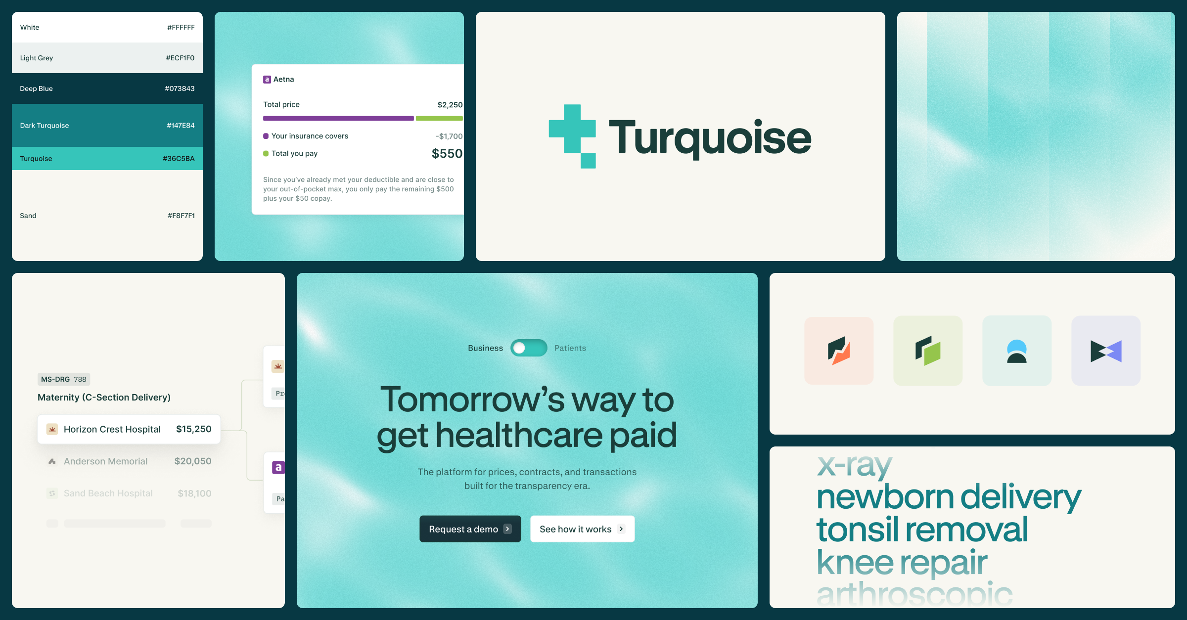
From there, our incredible partners at Fuzzco helped translate that idea into a visual system that feels both calm and illuminating. But how do you build out a design language that’s meant to convey transparency? We needed a hero visual to anchor the brand. After some exploration, we fell in love with caustics—the shimmering patterns created when sunlight refracts through water.
If you’ve ever looked down at the bottom of a pool on a sunny day, you’ve seen them. From sunny resorts to luxury beach cruises, caustics symbolize tranquility. Those patterns now ripple subtly through our brand and website, moving gently in the background. They’re quiet, calming, but intentional. They represent what transparency should feel like. It’s not clinical, not harsh, just light entering a system that’s been dark for far too long.
If you want to soak in those tranquil vibes, drag your cursor around the homepage hero and you’ll see our turquoise waters come to life.
Designing for change
Alongside our caustic visual motif, we built a broader brand expression that intentionally breaks from typical healthcare technology aesthetics. Healthcare technology has historically leaned in one of two directions: 1) extremely corporate, gray dashboards, dense language, or 2) overly clinical. Neither felt right for Turquoise.
The problem isn’t that the people building healthcare systems don’t care. It’s that the systems themselves were never designed to work together. The people working inside the healthcare system are thoughtful, mission-driven, and often incredibly patient. But they’re navigating tools and workflows that weren’t built to make things simple. That insight shaped many of our design decisions. We leaned into warmth instead of sterility. Clarity instead of jargon. Visual calm instead of visual noise. We also took some nods from what had worked well in our previous brand. We had always avoided jargon and prioritized a friendly, approachable tone. We knew we needed to take those elements and mature them. What resulted was not a full departure from our previous brand, but instead an elevated language that better suited our vision going forward.
A brighter palette, typography designed for readability, motion that felt natural and fluid, and imagery that reflected modern technology rather than legacy systems. And importantly, we landed on a brand voice that stayed human. While our platform is increasingly powered by powerful data and AI, we strongly believed:
In a world of AI, the brand should stay human.
Healthcare doesn’t need another robotic voice explaining complicated systems. It needs clarity, optimism, and a reminder that the people working in this industry actually want the system to work better.
The future of the brand
This evolution of our brand is just the beginning. It reflects a much larger shift happening across healthcare.
Transparency is no longer optional. Regulation is accelerating. Technology is enabling innovation. And the market is demanding change. The old way simply isn’t sustainable. We believe the future of healthcare will look very different from the past.
Prices will be visible, contracts will be understandable, and transacations will finally make sense.
And once people see how simple healthcare pricing can be, it’s hard to imagine going back. Our job is to help make that future real. Design just helps people see it sooner.
See inside the black box
Traceable data, unified workflows, and total transparency
Related resources
Learn, listen, and watch the latest on price transparency.
Reflections from a Day of testifying on The Hill
A nearly unanimous call to get accurate pricing in front of patients and employers.